As a UX & Visualization Consultant for Visual BI, I designed and developed dashboard demos for the company’s product, xViz.
The Process
- Empathize & Research – The demos target a user base constituting of power users and moderate – beginner level BI analysts. Requirements were gathered and segmented to design separate features of the visual.
-
- Define – Implementing principles of grounded theory, I extracted key insights from the requirements to form a coherent theory.
- Ideate – Use cases were brainstormed to cover various capabilities of the visual that the users can relate to.
- Prototype – I created wireframes, prototypes and finally Power BI reports to showcase use cases for each visual.
- Test – Usability testing was performed to incorporate changes in use cases and scenarios.
Design
The Live Demo for each dashboard can be found at https://xviz.com/visuals/
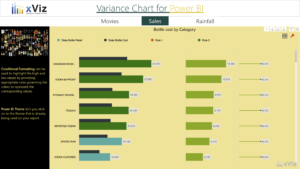
Variance Chart – for comparison, forecast, variance and percentage variance calculations
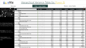
Hierarchical Variance Table – for calculating comparison, forecast and variance in a hierarchical level of granularities
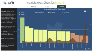
Multiple Axes Chart – To visualize more than two values using various axes and series type
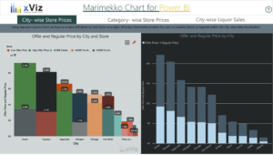
Marimekko Chart – To visualize more than two dimensions, color coding a different type of data value
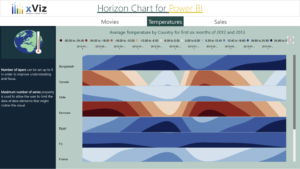
Horizon Chart – A multilayer visualization to show value change for various time periods using a separate axis for each category
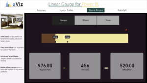
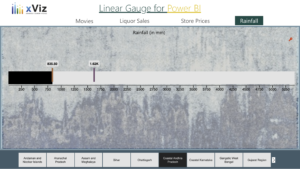
Linear Gauge – Visualize actual and target value comparisons
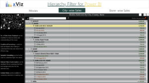
Hierarchical Filter – Hierarchical slicer for filtering values at various levels
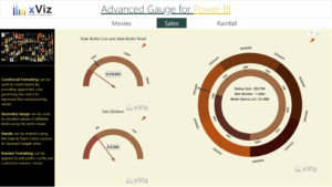
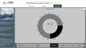
Advanced Gauge – Using needle and indicators for showing actual and target values; incorporating primary and secondary gauges