
The Aim
Propose a Power BI dashboard for website analytics that provides easy retrieval of data across various dimensions of the company and time periods.
Made For: Business executives, Marketing executives
Research
Understand the user requirements, form codes by extracting keywords from the user interviews based on grounded theory. Segment the codes to form a theory. Display critical insights rather than cluttering the dashboard with data. Implement UX principles to business intelligence dashboard designs and implementation.
User Persona

Mike is a marketing executive. Being a visual person, he prefers visuals over textual data. He is tired of excel and now wants to switch to Power BI dashboards to make strategic decisions to promote his services and products based on the visits on his business website. The dashboard I propose will enable Mike to extract the most and least visited pages and content of his website. Further, his requirement of filtering the organizations, regions, and duration for segmented data extraction will also be provided.
Design Principles
In contrast to the existing dashboard, this design focusses on the following design principles:-
-
- Consistency – The interface provides a consistent design for all reports throughout the dashboard.
- Affordance – The dashboard will cater to providing understandable insights rather than data in a coherent manner. The main report will provide a sense of data-driven storytelling to summarize the entire dashboard.
- F-pattern – Most critical data is placed on the top left and least on the bottom right based on the users’ sight pattern while scanning data on a page from left to right.
- Accessibility – Keeping the design aimed at an all-inclusive user base, the contrast ratio has been verified using the WCAG guidelines. This will enable the colorblind people to access the dashboard.
- Aesthetics – The dark color scheme for the background will underscore the values displayed. Using white space to improve understanding of the visuals chosen appropriately.
Mapping

User Model and Designer Model
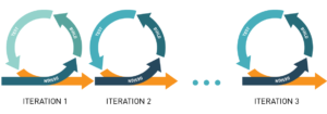
Agile Process – Rapid Iterative Design
Wireframes
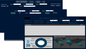
Iteration 1: Placing filters under the heading, report heading in the center, client logo on the left and company logo on right. The different departments and dimensions of the company have been used as two groups of tabs. Time filters are grouped together, separate from the region filter. Feedback will be provided by highlighting the background for the selected tab.
Iteration 2: The previous design involved too much information so the description of the tabs has been removed. Also, the tabs if selected now, will be underlined to show feedback.
Iteration 3: In order to accommodate another filter instead of placing it as a separate visual, the design for tabs is also changed. The tabs are now put together with descriptions on top. The location filter dropdown is not converted into a no-fill search option to increase negative space on the report. The visuals are placed with the location details placed at the bottom due to low priority.
Final Design – Iteration 4:
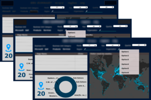
The visuals are rearranged from the previous iteration to make the layout consistent. Further, the drop-down options are added to generate a low to medium-fidelity prototype using Adobe XD.
Prototype
Medium Fidelity Prototype – showing a few interactions of the tab and filter option selections.
High fidelity Prototype – Power BI dashboard with the required data connections and interactions.