
The Aim
Prepare executive dashboard wireframes for a client by customizing design layout and display required KPIs and filter options.
Made For: Power Users – Skilled in Power BI
Research
Understand the user requirements, form codes by extracting keywords from the user interviews based on grounded theory. Segment the codes to form a theory. Display critical insights rather than cluttering the dashboard with data.
User Persona

George, a BI analyst wishes to understand his company performance-based measured on various KPIs. The current dashboard he uses for this purpose doesn’t allow him to derive insights belonging to a time interval. Further, the existing design is old- fashioned and he finds himself lost while interacting with the interface. Using my dashboard, George will be able to find the relevant data in minimal time along with a consistent user experience throughout the interface. I have proposed a filter that will allow him to select a period for which he desires to view the data.
Design Principles
In contrast to the existing dashboard, this design focusses on the following design principles:-
-
- Consistency – The interface provides a consistent design for all reports throughout the dashboard.
- Affordance – The dashboard will cater to providing understandable insights rather than data in a coherent manner. The Overview report will provide a sense of data-driven storytelling to summarize the entire dashboard.
- Accessibility – Keeping the design aimed at an all-inclusive user base, the contrast ratio has been verified using the WCAG guidelines. This will enable the colorblind people to access the dashboard.
- Aesthetics – The color scheme is chosen to customize the dashboard exclusively for the client by using a color scheme similar to the client’s business website. Using white space to improve understanding of the visuals chosen appropriately.
Mapping

User Model and Designer Model
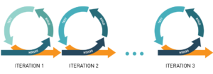
Agile Process – Rapid Iterative Design
Wireframes
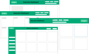
Iteration 1: Placing filters on the right, report heading in the center, logo on the left. The KPI metrics cards are designed with a hazy background to highlight the values. Used a lighter shade of green.
Iteration 2: The background changed to white to improve visibility and increase white space on the report.
Iteration 3: Rearranged the different segments of the layout. Moved filters to the center to emphasize, moved the logo to the right and heading to the left.
Iteration 4: Moved the placement of the segments to the original state, distributed the filters on the left and top, grouping them based on department and duration.
Final Design – Iteration 5:
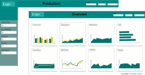
The overview report has a basic duration filter. The subsequent reports have detailed filter options. The color used throughout the dashboard is consistent with the use of a minimum number of colors. The shade of green has been changed to a lower brightness level. Further, a last refresh display has been added on the bottom right to inform the user of how recent the data is.