The Aim
To develop a new online trading marketplace for in-game merchandise like weapons, skins and other apparel, while providing a novel user interface that mitigates the pain points of the users which we identified using semi-structured interviews in this needs and requirements analysis. The plan was to provide transparency in the comparative shopping experience of online games. Additionally, we also follow various design principles aligning with the work of Norman- Nielsen in order to provide the users with a better interactive experience.
Team Project name: The Doombringers Made For: Game Enthusiasts
Team Members: 2
My Contribution: User research and Interface design
Research
Perform a needs and requirements analysis of customers performing in-game transactions, including, but not limited to purchase or trading of season passes, costumes, weapons, skins or any other accessory that enhances their in-game personas or resources

Design Principles
After research, it is discovered that current purchase interfaces lack the implementation of certain Don Norman design principles that are critical for rich user experience.
User Scenarios
 Greg is a rookie at shooting games and just got started with Pubg. With time, witnessing his friends purchasing weapons to add to the gaming experience, he is in search of a visible, usable and functional
platform that offers guns of his choice. Signing into the Doombringers website, Greg will be recommended weapons based on his friends’ purchases along with the most trending items. This will ease the selection process for him. Given the visibility of a shopping cart, he will be smoothly navigated to the final purchase. Unlike other websites, Doombringers website will give new users like Greg, an actual feel of the
weapon they purchased by toggling to the “trial page” where they can view their character in the gaming area.
A hardcore shooting gamer, Amelie, has been playing Pubg for over six months now. Fed up
with the traditional tedious gaming accessories selling websites, she is looking for a different purchasing experience. She wishes to browse through different facets of a character: skins, weapons, powers, with minimal difficulty. Amelie will be able to access the multifaceted aspects of her
character by going to the “Filter” page. She can add or drop different elements to refine her search. Being a professional user, Amelie doesn’t want distractions. Since, we eliminated pop- up recommendations, the purchase will be a smooth process.

Clark, an organized person, and a Fortnite enthusiast detest the accidental purchases due to bad feedback on websites. He wants to compare among different weapon choices based on caliber, rounds, weight. Also, the purchase should be informative at every step, keeping him aware of the entire process flow, so he doesn’t end up buying unwanted items. Clark can perform a comparative search based on the various filters proposed by the “Filter” option. He would receive confirmation alerts upon every selection and at the end an email invoice of his purchase. As opposed to conventional websites, our website offers a shopping cart button. This enables Clark to view all the items he opted to buy, eliminating the chance of a random purchase.
Mapping

User Model and Designer Model
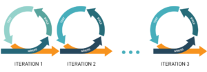
Agile Process – Rapid Iterative Design
Interaction Design
Information Design
Visual Design
Wireframes
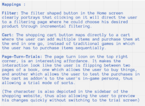
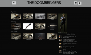
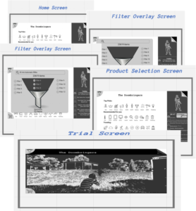 Home Screen – The filter button helps the user narrow or be more specific in his/her search. This button is filter shaped to provide the user with a visual cue to its usage. It aids the user in filtering the products. Clicking the filter button
will direct the user to a page where the user can select the various facets with which he/she can filter.
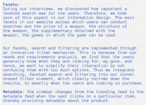
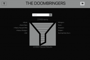
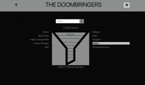
Filter Overlay Screen – The new screen that opens upon clicking this button enlarges the filter button to full size, with the filters, contained in it. It has a ‘+’ which allows the users to add the filters. This helps us to narrow down the list of products that are being displayed. The overlay is designed in the shape of a filter that supports incremental filtration of the list of products. The funnel end of the filter provides the total number of results obtained, and this text is a hyperlink. Clicking on it takes the user back to the base screen with the filtered products displayed. A part of the screen displays products that are in trend. These are used to attract the attention of the users. They include the most bought items by all gamers, the product bought by a celebrity, products bought by the user’s friends, products that support trading. The trending list stays in action when no products have been selected by the user and he/she is just browsing.
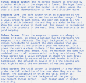
Product Selection Screen – Most of the users would do bulk purchase when they enter the shopping UI. But the shopping designs in the market for games currently do not support bulk purchases. The user needs to shop multiple times. We provide a shopping cart for this purpose. The user can select all the products that interest him and drop them in the cart. Finally, when he wishes to check out, he would be provided with a summary of all the items purchased. We haven’t explored the shopping cart screens in our current lightweight prototype.
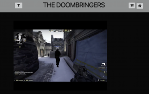
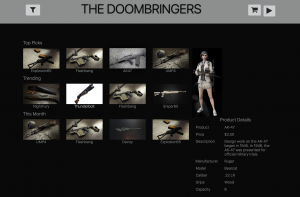
Trial Screen – This screen provides the user with a full experience of the product. This screen displays the avatar of the user holding the weapons selected by the user, wearing the outfits selected by the user and allows the user to get the ‘feel’ of the product. A user can have the trial for a predetermined amount of time after which the page is directed to the screen which was previously displayed. The user can also click on the top-right icon to be directed back to the previous page.
Final Design
I like a handgun. I hold a shotgun in high regard; but rifles — well, I love the darn things.